
Unfortunately, the meeting was canceled due to inclement weather. Fortunately, the Fox Valley Group was open to sharing their presentation in a “virtual format,” and while not as wonderful as seeing everything in person, it’s not so bad, either.
Overview: The Crayon Challenge
The basic premise of the project was to pull four crayons at random from a box and work with the colors to create a woven object. According to study group member Sheri B, “Being an oil painter/artist, I presented a study of color from an artist’s perspective, which also involves a knowledge of how color affects us from scientific studies. Essentially in the current art world, color is used primarily for its emotional voice for the artist and the viewer. For example, the artist Rothko embraced the color/emotion relationship reducing his works to juxtaposed blocks of color to present his state of emotion and transferring that to the viewer sharing that emotion.
Scientifically, we have instinctive responses to color and learned contextual responses. Having a knowledge of these effects makes color an effective means of communicating and manipulating, which I think could provide a deeper layer of interest in our weaving, sort of a secret language.”
(Sources: Much of the scientific research is from The Great Courses, “How Colors Affect You/What Science Reveals” and Sheri’s own knowledge of art gained through education and experience.)
Sheri B’s Project
After pulling my four colors the next step was to decide what to do with them. Since this was a color study, I wanted to put the colors in the most disadvantaged position I could think of for weaving at first. Working with two neutrals and a green and blue didn’t seem like a favorable beginning. Plus, I wanted to use thread from my stash rather than purchase and I matched them to the color created from rubbing the crayon on white paper as opposed to the apparent color of the crayon itself. I came up with a very fat blue cotton that on later consideration could have been pulled into its component strands easily, but I used it fat. I had some 10/2 brown and 10/2 green that I felt matched reasonably. For the grey, it seemed to need more of a shimmer, and I took a 10/2 un-mercerized grey and combined it with some thin weight of grey rayon. That gave it more dimension that I felt the crayon color had. While plain weave can impart a beautifully soft and subtle look it wasn’t going to particularly give one color advantage over the other. The grey is light which like white would wash out color. The blue being fat was more pronounced, so it did have some advantage. From that I chose to make the warp grey. In weaving I tried many different widths of colors in different combinations to see how it helped colors speak for themselves. Surprisingly, while these are not colors I would choose on my own, there were some combinations that were somewhat attractive.


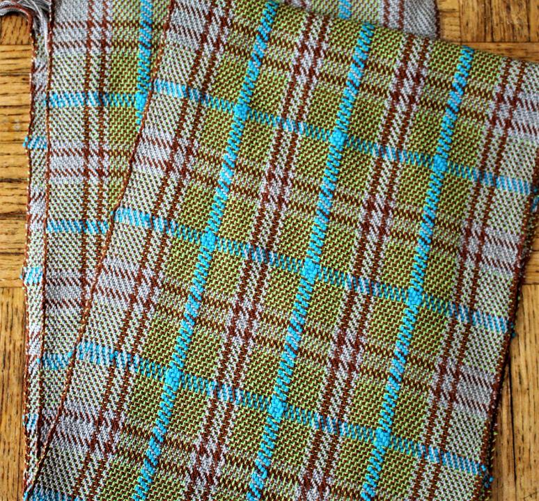
From there, I decided I wanted to tackle a tartan plaid. The twill should lend more support to highlighting the colors more favorably. I chose to think of the brown as a red and matched it to the green. The blue was to be an accent color and then grey as a solid with only the weft changing its color. I alternated the brown and green thinking it would give an overall brown. Hmmm. While weaving, I realized I could not effect a tartan, as the different thread widths would not allow for a balanced pattern. I have just a plaid. The somewhat surprising affect on the green was to push it more yellow, while the green crossing the grey became cooler in color. The overall brown look I expected didn’t really happen.
I never have enough time to do all the study pieces I would like. If continuing to study this, I might prefer to opt for the same combination but with altered colors, for example, change the reddish brown to more of a chocolate or greenish brown, the green to a cooler color and the grey darkened to a charcoal. The blue could stay the same or go cooler also. Then I would try a weave in which the colors are represented alternated by single threads in some combination both warp and weft and a pattern that has a bolder patterned shape such as in an overshot or some such structure or effect.
Kathy S’s Project
I decided my Color Study structure would be Echo Weave. I selected my own colors. It took me more than one warp to figure out what works. All of the samples were woven using the same threading. The yarns are all Webs 8/2 tencel, sett at 28 epi.
This is what happens if the warp doesn’t have enough contrast:
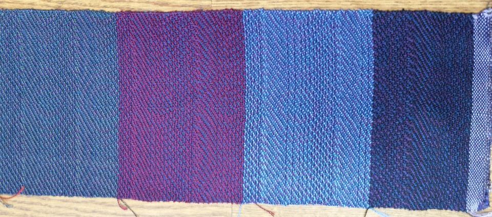
It was a pretty warp on the loom, but no matter what weft I used, the pattern didn’t show. The warp colors are Amethyst & Navy. After thinking about it, I wound a warp with half the number of ends in the total warp using Olive & tied it on to the Navy ends & pulled them through. The result was much better:
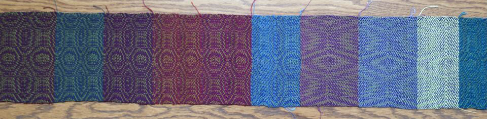
Next, I tried a four-color warp. The warp colors were Red purple, Lemon grass, Dark teal, and Azure.
The final fabric:
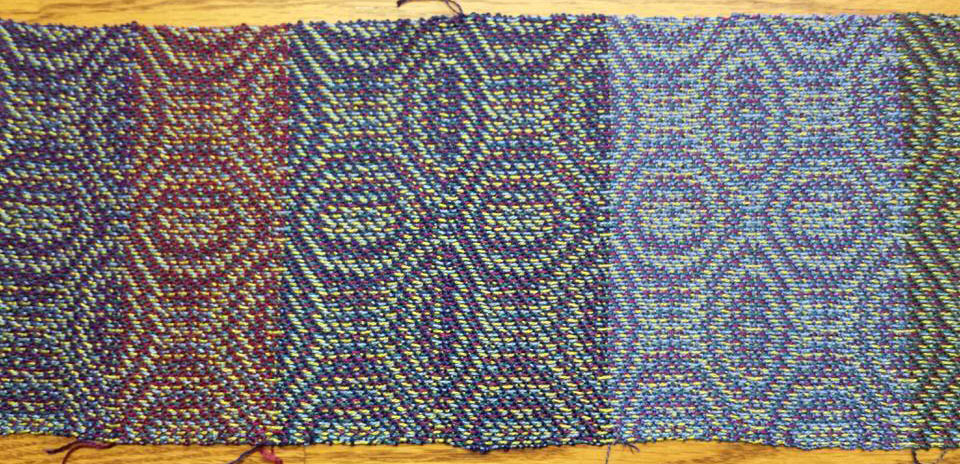
Kathy’s finished project:
Maxine M’s Project
I was doing a trial run with only three colors. As I was weaving off the back, I ran out of warp. I was so angry I never added the fourth color. Fortunately, I found some candle holders on clearance for 75% off that really made the runner work.


Diane W’s Project
I call this project “I get by with a little help from my weaving friends!” You can see the four crayons I drew, the paint color cards I felt best matched them, and the yarn I used for my project. When I said I wanted to weave dishtowels, Ellen BG suggested a couple of patterns from Handwoven. I ended up using one of those, which is crackle weave, and I love that it really isolates the colors so they aren’t running together. During the summer we had ‘dye’ day at Billie M’s, and I dyed the rose brown color which I thought turned out really well. Billie also had in her stash the lime green I needed again help from a friend. In September, Jennifer C gave a presentation on Fiberworks, which prompted me to purchased it. I put the pattern into it and rearranged my colors until I was satisfied with them. So several fellow weavers assisted me with this project and I’m happy with the way the dishtowel turned out!


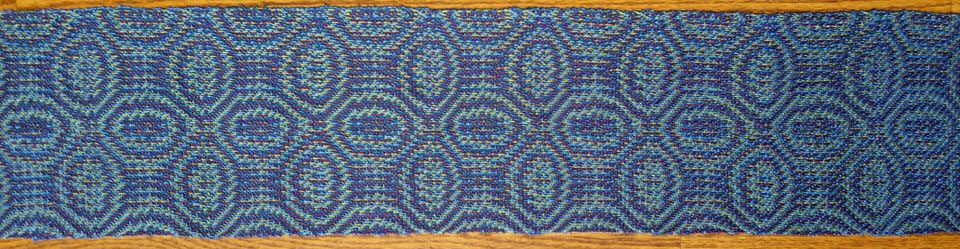
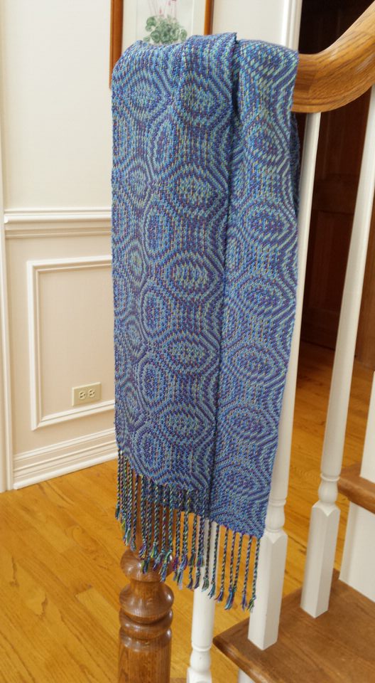
Sue Z’s Project
The crayon colors that I drew were melon, burnt sienna, red violet, and brown.
During a color exercise presented to our group by Phyllis S, I experimented by placing paint color cards (of my crayon colors) on white, light gray, dark gray and black backgrounds. It was interesting to see how the colors brightened or became muted depending on the background color.
At another one of our meetings, we discussed the importance of considering the interplay between colors, and the effect the amount of a color can have on a project, when it is to be viewed from a distance (such as when making a wall hanging or a coat) verses viewed up close (as in a scarf).
For my final project, I chose to make a scarf using a mixed warp of chenille, tencel, cotton and metallic yarns. I designed the warp stripes on the warping board. For the weft of the scarf I used three of the warp yarns (brown chenille, lipstick cotton, and ecru tencel). I also made a sample by using black tencel in the weft instead of ecru tencel and by adding melon colored stripes.


Karen R’s Project

